My Portfolio
Before I took on the assignment of redesigning my portfolio, it was in pretty bad shape. It wasn’t mobile friendly, it wasn’t easy to edit content, and customizing the frontend was hard to do as I didn’t have a defined workflow. As a Frontend Developer, a site with this many issues isn’t something I’d want to show off to any employer.
For the next iteration of my portfolio I’d need something that:
- Is mobile friendly
- Allows me to edit HTML faster
- Used a custom CSS framework
- Looks nice

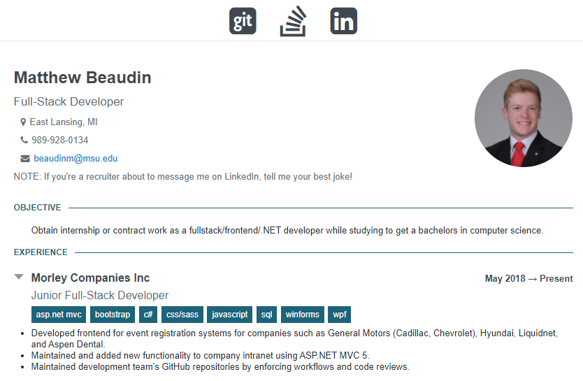
Original portfolio design
This redesign was essentially based around the CSS framework. Making my own framework would allow me to write custom UI modules, give me the freedom of having a lightweight and easy to use code base, and would look good on a portfolio. Using a larger frontend framework wouldn’t be very beneficial in this situation, as it’s a small site and content is relatively simple.
The web is currently flooded with over-engineered sites that take too long to load. My portfolio site doesn’t need to use the same framework that a massive social media company uses. The minified size of my framework is 28.1 KB and Bootstrap’s is 147 KB minified. I could compress even more if I used gzip but I’m still testing some build processes so that will have to wait.
Making the site work well on all devices was surprisingly easy. Most of the content on the portfolio is essentially the same on desktop and mobile. The hard part was understanding how to build a CSS grid system. In CSS, websites are crafted using columns and rows (mostly). Mainstream frameworks include a wide range of column and row sizing options that you can apply. But I don’t need all the extra bells and whistles, just something functional and light.
The biggest benefit of my framework is how little HTML you have to write. Larger frameworks use multiple CSS class names per HTML element. This can lead to writing way more code than you actually need, as well as making it difficult to manage. Since the scope of the portfolio is relatively small, I don’t need the majority of what these have to offer.
The best aspect of this project to me is the framework. It’s simplicity is it’s advantage since it’s essentially the bare bones of what a website needs to look halfway decent. With some more work I can also use it with component based Javascript frameworks like React, Elm, etc.